Web Development Web Development Tutorials for Beginners and Intermediate Learners 4 weeks agoAdd Comment
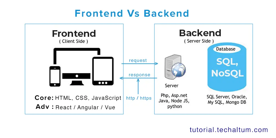
Web Development Front-end vs. Back-end – Client-side vs. Server-side Development 2 months agoAdd Comment