
In the world of web development, creating websites that are both functional and visually appealing requires more than just HTML. While HTML provides the structure and content of a webpage, CSS, which stands for Cascading Style Sheets, brings style, design, and layout to life. CSS allows developers to control the appearance of web elements, creating a seamless user experience and making websites aesthetically engaging. Understanding CSS is crucial for anyone involved in web design or development, as it forms the foundation for modern website presentation.
What is CSS?
CSS is a stylesheet language used to describe the presentation of a document written in HTML or XML. Unlike HTML, which focuses on content structure, CSS focuses on how that content looks. With CSS, developers can control various design aspects such as colors, fonts, spacing, borders, and layouts. CSS is called “cascading” because multiple styles can be applied to the same element, with specific rules determining which style takes precedence.
CSS can be implemented in three ways:
- Inline CSS: Styles are written directly within an HTML element using the
styleattribute. For example,<p style="color: blue;">Hello World</p>. - Internal CSS: Styles are defined within a
<style>tag inside the HTML document’s<head>section. This method is useful for styling a single page. - External CSS: Styles are written in a separate
.cssfile and linked to the HTML document. This approach is ideal for maintaining a consistent design across multiple pages of a website.
Using external CSS is generally considered best practice, as it keeps the HTML clean and allows for easier maintenance.
The Importance of CSS in Web Development
CSS plays a vital role in web development for several reasons:
- Visual Appeal: CSS allows designers to create visually attractive websites. It provides control over typography, colors, backgrounds, and layout elements, enabling designers to establish a brand identity and make a website appealing to users.
- Consistency: With CSS, styles can be applied across multiple pages of a website, ensuring a consistent look and feel. A single CSS file can control the appearance of an entire site, reducing redundancy and effort.
- Separation of Content and Design: CSS separates content (HTML) from presentation (CSS), making it easier to update the design without altering the content. This separation enhances maintainability and scalability.
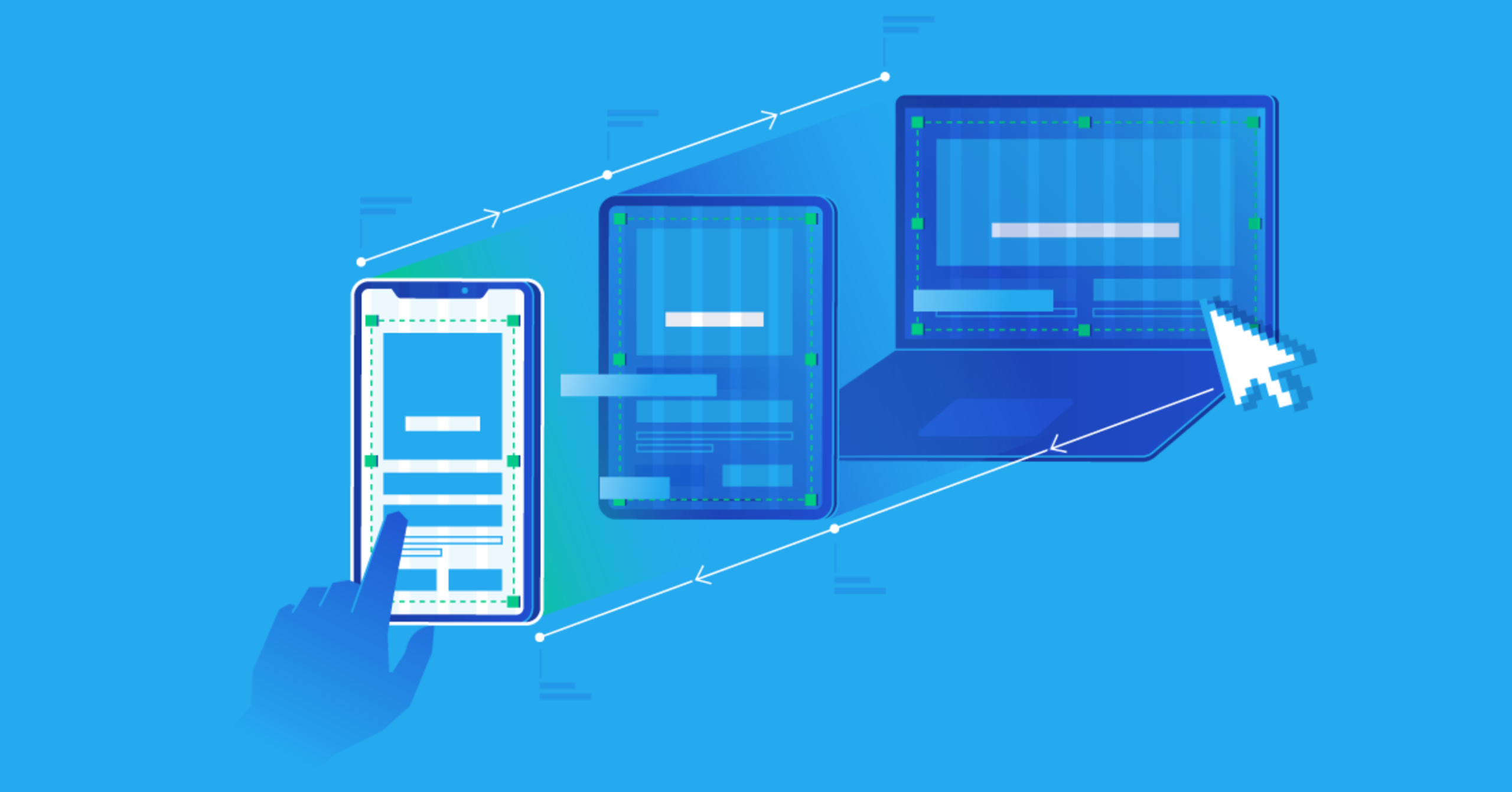
- Responsive Design: CSS allows websites to adapt to different screen sizes and devices. By using techniques like media queries and flexible layouts, developers can create a responsive design that works on desktops, tablets, and mobile phones.
- Performance: Proper use of CSS can improve website performance. By reducing inline styles and using external stylesheets, browsers can cache CSS files, speeding up page load times.
CSS Selectors
CSS works by targeting HTML elements through selectors. Selectors define which elements will be styled and can range from simple to complex. Some common types of selectors include:
- Type Selector: Targets elements by their tag name. For example,
p { color: red; }will make all paragraphs red. - Class Selector: Targets elements by their class attribute. Classes are reusable. For example,
.highlight { background-color: yellow; }. - ID Selector: Targets a single element with a unique ID. For example,
#header { font-size: 24px; }. - Attribute Selector: Targets elements based on their attributes. For example,
[type="text"] { border: 1px solid gray; }. - Pseudo-classes and Pseudo-elements: Target elements in specific states or parts of elements. For example,
a:hover { color: green; }changes a link’s color when hovered.
By combining selectors, developers can target elements with precision and apply styles efficiently.
CSS Properties for Styling
CSS offers a wide range of properties to style elements. These properties can be grouped into several categories:
- Text and Font Styling:
color: Sets the text color.font-family: Defines the font.font-size: Sets the size of the text.font-weight: Controls the thickness of the text.line-height: Adjusts spacing between lines.
- Backgrounds and Borders:
background-color: Sets the background color.background-image: Applies an image as the background.border: Adds borders with customizable width, style, and color.border-radius: Creates rounded corners.
- Spacing:
margin: Controls the space outside an element.padding: Controls the space inside an element.gap: Defines space between items in a layout, commonly used in flexbox or grid.
- Box Model:
Every element in CSS follows the box model, which consists of content, padding, border, and margin. Understanding the box model is essential for creating layouts with precise spacing and alignment. - Display and Visibility:
display: Determines how an element is displayed (block, inline, flex, grid, none, etc.).visibility: Controls whether an element is visible or hidden.
- Positioning:
position: Specifies the positioning method (static, relative, absolute, fixed, sticky).top,right,bottom,left: Define offsets when using positioned elements.z-index: Controls the stacking order of elements.
CSS Layout Techniques
One of the most powerful features of CSS is its ability to control layout. Proper layout ensures that content is organized, readable, and visually pleasing. Several layout techniques are commonly used:
1. Normal Flow
The default layout method where elements are displayed according to the HTML structure. Block elements stack vertically, and inline elements flow horizontally.
2. Flexbox
Flexbox is a layout model that allows elements to align and distribute space efficiently within a container. It is particularly useful for creating responsive designs. Key properties include:
display: flex;to activate flexbox.justify-contentto control horizontal alignment.align-itemsto control vertical alignment.flex-wrapto wrap items onto multiple lines.
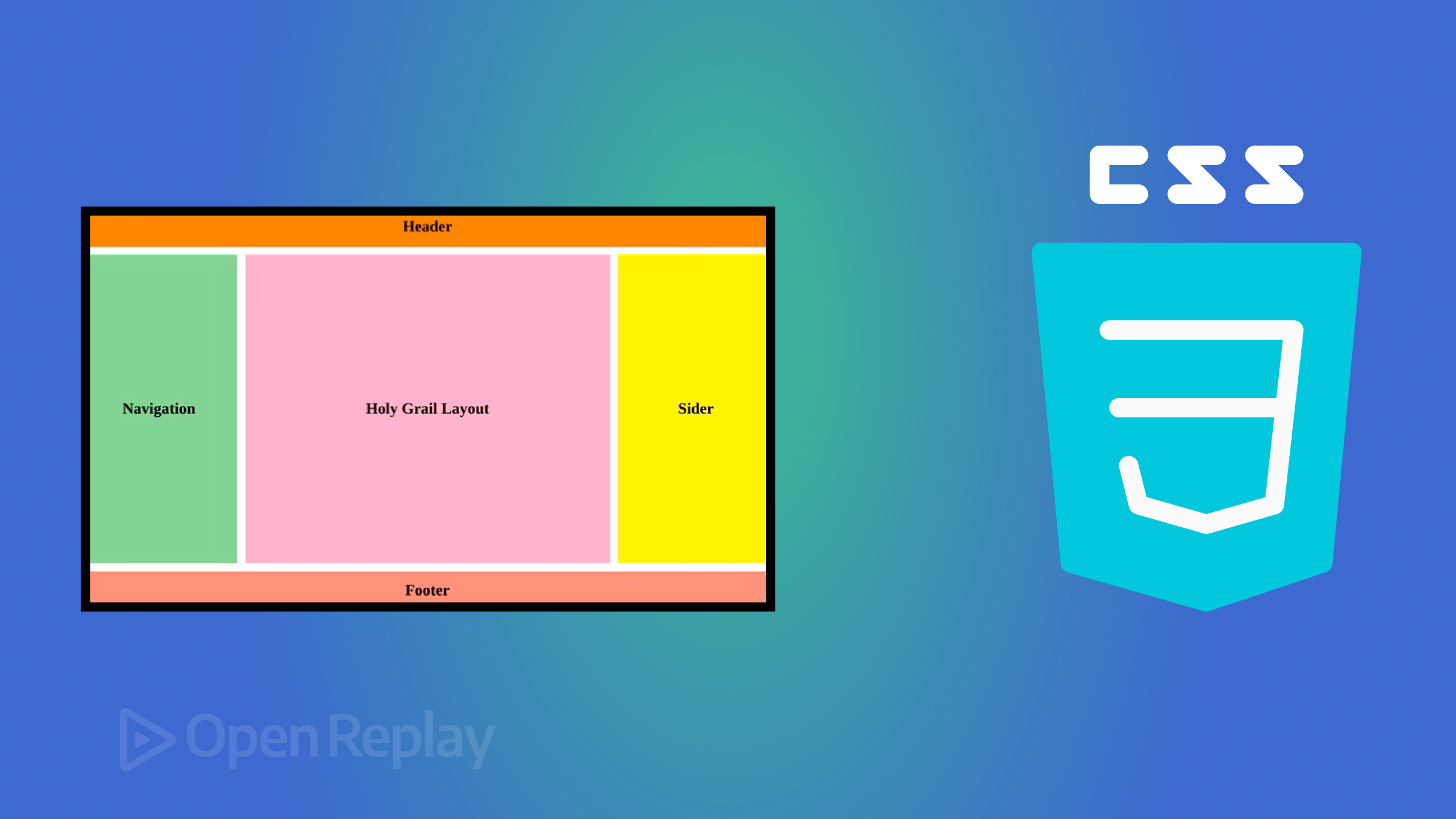
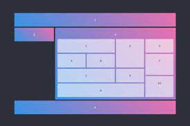
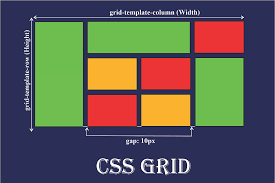
3. CSS Grid
CSS Grid is a two-dimensional layout system that allows precise placement of elements in rows and columns. It is ideal for complex layouts. Key properties include:
display: grid;to enable grid layout.grid-template-columnsandgrid-template-rowsto define the structure.gapto set spacing between grid items.grid-areato position elements in specific grid cells.
4. Positioning
Absolute, relative, fixed, and sticky positioning give developers control over element placement on the page. These techniques are often combined with Flexbox or Grid to create dynamic layouts.
5. Responsive Design
Media queries allow designers to apply different styles based on screen size, resolution, or device type. For example:
@media (max-width: 768px) {
  body {
    font-size: 14px;
  }
}
This ensures websites are accessible and functional on all devices.
Advanced CSS Features
CSS is continually evolving and includes advanced features that make web design more powerful:
- CSS Variables (Custom Properties): Allow developers to define reusable values for colors, fonts, or spacing.
- Animations and Transitions: Enable smooth motion effects for interactive elements.
- Transformations: Rotate, scale, or skew elements to create dynamic designs.
- Filters: Apply visual effects like blur, brightness, and contrast.
- Grid and Flex Enhancements: New properties provide even greater control over layout behavior.
Best Practices in CSS
To maximize the benefits of CSS, developers should follow best practices:
- Keep CSS Organized: Group related styles and use comments for clarity.
- Use External Stylesheets: Promote reusability and faster page load times.
- Avoid Inline Styles: Keeps HTML clean and separates content from design.
- Leverage Classes and IDs Efficiently: Use classes for reusable styles and IDs for unique elements.
- Optimize for Performance: Minimize redundant CSS and use shorthand properties when possible.
- Test Across Browsers: Ensure consistent appearance on all major browsers and devices.
Conclusion
CSS is an essential tool in modern web development. It transforms plain HTML into visually appealing and user-friendly websites, providing control over styling, layout, and responsiveness. From simple text color changes to complex grid-based designs, CSS offers immense flexibility and power. By understanding CSS fundamentals and layout techniques, developers can create websites that are not only functional but also visually compelling, consistent, and optimized for all devices. Whether building a personal blog, an e-commerce platform, or a corporate website, mastering CSS is a cornerstone of successful web development.
